At first glance it is simple. The “T” in HTML is for text; the “G” in SVG is for graphics. We have two distinct worlds.
But then we can look at the real world of shop signs, corporate logos, CD and album covers, packaging, and labels and we find that the artists of the real world have blurred the line between text and graphics in fascinating ways. In the Arab world, as in the world of Chinese calligraphy writing and art, semantics and geometry become juxtaposed, fused and counter-pointed in ways numerous and hard to categorize.
In this paper we are interested in exploring the relationship between the characters of text and the geometry of their presentation. We’re also interested in discussing how that relationship can affect accessibility in various ways and for various audiences. We’re also interested in identifying some of the ways that SVG as a standard, and that SVG authors as practitioners might improve accessibility for graphically rich text. Ultimately, we’re interested in raising (or perhaps re-raising) the issue of what is the difference between presentation and semantics when it comes to graphics.
As the popularity of incorporating SVG graphics on web page increases, so do the implications for accessibility especially if a broadened definition of accessibility is employed. Our broadened definition of accessibility within the graphical environment includes the visually impaired and the blind, but is expanded to also include the human reader of code and future search engines. Often times, SVG is read and modified by the human coder and thus needs to be readable. This type of readability is analogous to the concept of self documenting code that is encouraged (and oft required by organizations) of programmers creating desktop applications. The expansion of the accessibility definition to include search engines is a result of recognizing the fact that future search engines may display or index SVG. Consider search engines of the future looking for examples of pentagons found in North African tilings rendered in SVG. Current HTML-oriented search engines can find the words pentagon, pentagonal, Pentagoni, البنتاغون, պնտագոն, beşbucaq, pentagono, пяцікутніка, পঁচভুজ , петоъгълник and even recognize similarities in their meaning. Might it be unrealistic to think that SVG-aware search engines might one day be able to find and "understand" the similarities between the rollowing geometric instantions of pentagons? We think not, but we think it may be time to begin to envision such a day.
 |
 |

|

|
| SVG
path (five points) -- a convex pentagon <path fill = "#771fab" d="M 257 189 188 285 77 248 77 131 188 94 z" stroke = "black" stroke-width = "1" /> |
SVG
path (five points) -- a convex pentagon <path fill = "#f83379" stroke = "black" d="M 32 55 111 41 157 106 120 145 25 98 z" stroke-width="3" /> |
SVG:polygon: Six coordinates; first two redundant <polygon fill = "#f83379" stroke = "black" points="32 55 32 55 111 41 157 106 120 145 25 98" stroke-width="3" /> |
<clipPath id="C"><path d="M 32 55 111 41 157 106 120 145 25 98 z" /> </clipPath> <image xlink:href="p17.jpg" width="180" clip-path="url(#C)" height="170" /> |
Background
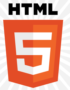
Obviously, desc and text tags can be used by programmers to address the problem. However, programmers are notoriously lazy and do not often use these descriptions. In the United States, the nondiscrimination requirements in Title II of the Americans with Disabilities Act (ADA) applies to state and local government websites. The toolkit [REF1] specifically mentions HTML tags, but does not yet mention SVG tags.Currently, websites often rely on graphics to convey meanings: many companies now draw their logos (e.g., HTML5 logo), graphics for often used symbols (e.g., copyright symbol and non-copyright symbol, text is drawn (word art), an textual effects of a visual nature (word art, word puns, calligrams, shape poems). When graphics are relied on, a visually impaired person may miss the semantics of the page.
Content accessibility guidelines do exist for SVG [REF2]. The content accessibility guidelines according to the W3C recommendation include: provide text equivalents for graphics, do not rely on color alone, use markup and styles sheets properly, clarify natural language usage, and ensure that dynamic content is accessible. In addition, the W3C recommendations include authoring tool accessibility guidelines and user agent accessibility guidelines.
What SVG can do currently with text: theory and practice
The SVG 1.1 specification for text [REF3] is approximately 90 pages long (if printed). SVG provides the ability to vary these properties of text:- Directionality (left to right being the default)
- Inter-word and inter-character spacing
- Vertical Alignment (relative to baseline)
- Decoration (things like boldface, underline and the like)
- Orientation (rotation)
- Squeezing to fit (using textLength and lengthAdjust)
- Relative sizing (using viewBox)
- Aligning to a curve (using textPath)
- Substring styling (using tspan)
- The character set itself (using SVG fonts and WOFF)
Additionally, through others of SVG’s features (like masks, clip-paths, filters, gradients, transforms, animation, replication, pattern, and script) , we have the ability to
- Fill typefaces with all manner of texture and pattern
- Rotate, stretch, and skew text
- Distort the shapes of characters (using feDisplacement)
- Fill typefaces with animation
- Animate text moving along paths
- Simulate 3D effects
- Vary shapes of glyphs dynamically
- Flowing text into a rectangle (as in the HTML <textarea>)
- Glyph to path conversion for access to font geometry
- Flowing lines of text into shapes (as with word poems)
- Allowing text to be “top-aligned” so that characters conform to a top-line rather than a baseline.
- Reshaping glyphs to fit non-rectangular containers.
Examples of text departing from standard alignment:
How do people use text in “the wild?”In beginning work on this subject we sought to gather examples of real world uses of text. We not only kept a lookout for such things as shape distortions and varied geometries, but did some Internet searching for special text effects.
A wide variety of interesting effects were found. (Many can be seen at http://srufaculty.sru.edu/david.dailey/svg/top-align.htm )
In this section we will present some "found examples" of natural text
Top alignment
SVG has long recognized that text flow (directionality) as well as alignment vary as a function of language. The SVG spec mentions specifically the Indic scripts as varying baseline alignment: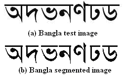
However one need not go to India nor Bangladesh to find examples of varied alignment as the following examples demonstrate.
 |
 |
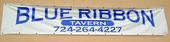 |
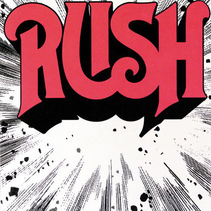
Book cover from: http://www.glogster.com/media/4/14/98/42/14984230.jpg see also http://www.rangersapprentice.com/ |
Rush album cover from: http://www.canadiandesignresource.ca/officialgallery/ wp-content/uploads/2008/07/rush1974.jpg |
Shop sign (western PA), from: http://c2.ac-images.myspacecdn.com/images02/ 87/m_fe64ca0fef8b45dab7c29db8e31eec89.jpg |
If one actually looks for top-aligned English text, it is in fact fairly common. But this is not an easy effect to accomplish in SVG, even with script. See for example the discussion in the public archives of the SVG Working Group (at http://lists.w3.org/Archives/Public/www-svg/2011Jun/0006.html )
Experiments with making top-aligned text using SVG and JavaScript may be seen at http://granite.sru.edu/~ddailey/svg/tspanmeasure.svg and http://granite.sru.edu/~ddailey/svg/tspanmeasure4.svg
The last attempt is actually successful in Opera, but here are the results of trying to top-align text in different browsers:
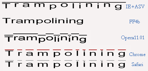
Figure 1: http://srufaculty.sru.edu/david.dailey/svg/TopAlignBrowsers.png
Dual curve alignment
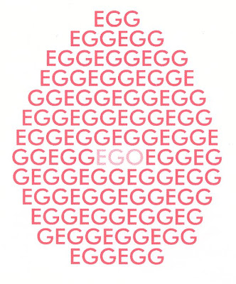
In the authors' search for examples in-the-wild of top-aligned text, we found, somewhat to our surprise, that "dual alignment" in which text is aligned simultaneously to be a top and bottom curve is actually more common still. It is a far more common typographical effect than we would have predicted at the beginning of our analysis of such things. Herewith are just some of the many examples: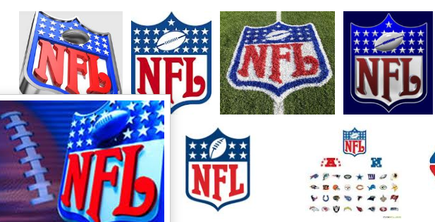 |
 |
 |
|
| Google image search for NFL logo | HTML 5 logo: http://www.w3.org/html/logo/ |
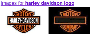
Google image search for Harley-Davidson logo | d |
 |
 |
 |
|
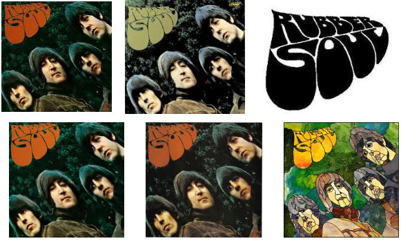
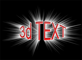
| Google image search: Rubber Soul | Album cover -- Herb Alpert's Tijuana Brass | Photoshop effect from http://www.photoshopfiles.com/photoshop/ text_effects/3d_text_effects__499.html |
|
 |
 |
||
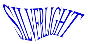
| From http://obeyclothing.com/blog/?p=1875 | Cooler Master logo: http://www.coolermaster-usa.com/ |
Text effect: http://wsmithdesign.wordpress.com/ 2010/05/26/silverlight-text-effects/ |
It is noteworthy that a) the glyphs themselves (and not merely their baselines and font-sizes) conform to the top and bottom curves and b) that these effects are not linear. That is to say the warping of the glyphs is often curvilinear and can not be produced merely by applying a perspective transform to the text.
Shape art: including word poems
Results of a Google image search for "shape poems", as shown below indicate that shape poems tend to be either designed to follow a path (currently possible in SVG) or to flow into a shape. Though the "rules" for how to flow text into complex shapes can be nontrivial, and probably are non-algorithmic, instead relying on the author's sense of semantics, legibility and good design.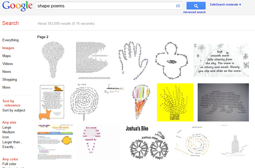
In the following examples, it is clear that even with SVG's current text-on-a-path and the proposed text-flow-into-a-shape, the curvilinearity of glyph reshaping can be quite complex at times.
 |
 |
| From
http://www.designflavr.com/resources/ 21-Inspirational-Typography-Artworks--from-DeviantArt-i116/ |
From http://www.hiddengarments.cn/index.php/tag/zhaoqing/page/4/ |
Glyph Distortion
 |
 |
| Source: http://www.superstock.com/stock-photos-images/1850-23262 | Source: http://arro-signs.co.uk/3d-letters/chinese-writing/ |
Glyph decoration:

Source: http://www.amazon.com/Wallmonkeys-Peel-Stick-Wall-Graphic/dp/B005IVQS98/ref=sr_1_23?s=baby-products&ie=UTF8&qid=1317522255&sr=1-23
Typographic Puns (double doubles)
The term "visual pun" often refers to things like this picture of a huge manatee (zepelin shaped) crashing into a tower with the caption "Oh the huge manatee!" Unlike the word poems,
for example, this from http://dbqp.blogspot.com/2007/03/this-is-your-body-this-is-your-blood.html :
these "typographic puns" tend to draw the concept of the word using exactly the letters of the word (no extras), with a bit of orthographic styling. The older reader may remember a semi-regular column in Playboy Magazine consisting of a page of typesetting puns.Here are several I remember from my youth:
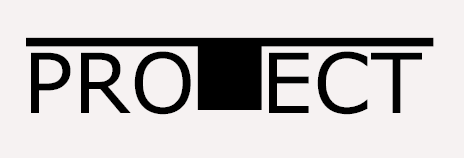
All but "PROTECT" viewed at http://granite.sru.edu/~ddailey/svg/embedpun.html in Opera. proTect as viewed in Internet Explorer with Adobe plugin.
Here are some others of the same general ilk that I was able to find on the 'net and that illustrate the very same concept:
From Adam Paxman at http://adampaxman.blogspot.com/2009/08/typographic-pun-fun.html
From http://jonahschrogin.blogspot.com/

From http://jamesbrook.wordpress.com/2011/01/10/watching-words-move/
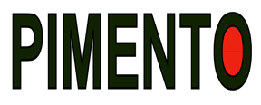
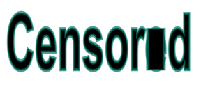
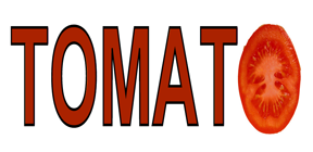
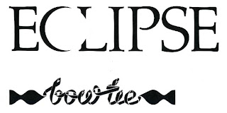
One of the points to be made from these sorts of examples, is that while the typographic effects are relatively easily brought about if the author is willing to hand-adjust the placement of the special effects (the mask in "ECLIPSE", the Tomato, or the rectangle in Censored) the current mechanisms available for performing many of these operations in script is virtually non-existent in SVG. Some browsers use getBBox, while others prefer getExtentOfChar. None seems to have implemented these things completely consistently with the spec. Furthermore, the ability to rescale the T in PROTECT is present only in the Adobe plugin and is apparently inconsistent with the spec on this matter. <tspan> tags within a <text> have very little control over positioning, other than the obvious tags and are not full partners in the SVG pantheon of tags. Applying transforms to stretch the font does not work except in IE/ASV and the ability to stretch parts of the font and not other will not become possible unless SVG exposes font-geometry to authors in some way.
More importantly for accessibility, without SVG fonts to allow the final O in tomato, or the obscuring rectangle in Censored to be viewed as glyphs, there is no way for a screen reader to determine what the word censored or tomato are unless the author overtly provides those accessibility cues manually -- something authors are notoriously negligent at doing!
Calligrams (extreme glyph distorition)
Calligrams are drawings made of glyphs. Here are some examples from Chinese, Arabic and English.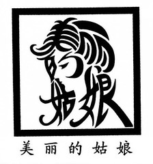
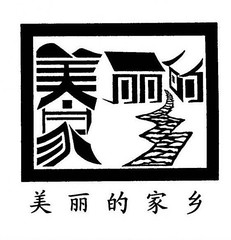
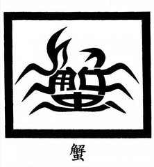
Copyrighted calligrams (linked in-line here) from http://www.flickr.com/photos/24235169@N04/with/4754291334/ (see also http://www.chinasmack.com/2010/pictures/chinese-character-art.html )
By Hua Jiang for the Beijing International Design Triennial. Source: http://en.bidt.org/designer/413.html

http://owl3d.com/tests/cylinder_text.svg
Text effects in the wild: an inventory.
The above examples (in various categories) all represent experiments with the geometry of text: either with the shape of the glyphs or their alignment relative to one another or both. It is natural to wonder how commonplace are these sorts of effects in behavior of designers, web authors, merchants, and typographers. Accordingly, we performed a quick inventory of textual effects by performing a search in Google Images for "font effects" and "text effects." About two hundred images were examined and about one hundred were selected for closer examination (about half were totally uninteresting, because of duplication, irrelevance, or illegibility.) The following shows some of the images and an intermediate stage in the process of classifying these effects.
Generally, it was observed that the predominant categories of "found objects" were
- simple effects that can easily be done in SVG through the application of colors or gradients
- application of pattern or texture to text -- such as could be done with <pattern> or <clipPath>
- distortions of the shape of text ( like lighting effects, starbursts, or blurring, as might use feDisplacement or feSpecular filters.
- drop shadow effects and other quasi-3D effects
- 3D extrusions
- texture effects (fire, metallic, water and plastic effects seem to be favorites)
- other (hard to tell if these are just unusual fonts or the application of special effects)
Text effects that are possible and currently supported in SVG
As illustrated above in Figure 1, browser support for text effects is not uniform. In fact as the author of one and a half books on SVG, one of this articles authors can claim that of the major components of SVG (including paths, masks, filters, patterns, animation, and text), text has the least consistency of cross-browser support of any of the other parts of the language. As such, some of the effects shown work only in some browsers. The most consistent and broad ranging support can be seen currently with the Opera browser, and as such, the reader may wish to use that browser for viewing some of these examples.Here is an example (visible at http://srufaculty.sru.edu/david.dailey/svg/text/textplay.svg ) in which browser support is markedly inconsistent:
Another involving vertical alignment (at http://srufaculty.sru.edu/david.dailey/svg/text/verticalText.svg ) shows similar cross browser problems.
Filling text with gradients or patterns (not clipPaths)
It is quite easy using <text fill="url(#pattern)" ... > or <text fill="url(#gradient)" ... > to fill text with either a pattern or a gradient. Here is one simple example of each.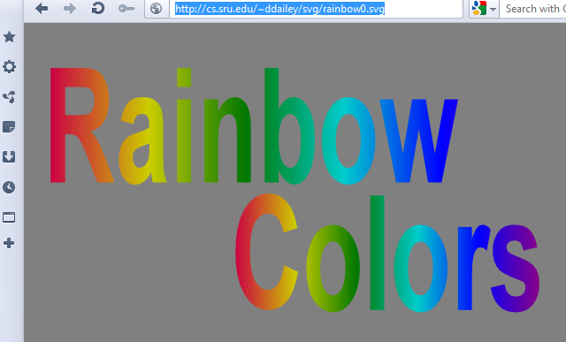 | 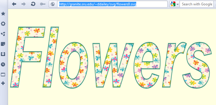 |
| Text filled with a gradient (See http://cs.sru.edu/~ddailey/svg/rainbow0.svg ) | Text filled with a pattern ( see: http://granite.sru.edu/~ddailey/svg/flowers0.svg ) |
See also
- http://srufaculty.sru.edu/david.dailey/svg/text/Taxi5.svg
- http://srufaculty.sru.edu/david.dailey/svg/text/slate1.svg
- http://srufaculty.sru.edu/david.dailey/svg/text/colorful1.svg
One thing that SVG can do with such effects that is not so easy to do with bitmapped formats (such as jpg, png, gif, and <canvas>) is to animate these effects by adding a simple lines of declarative code. Here are three examples that illustrate the terseness and simplicity of SVG animation:
Animated effects using gradients or patterns
- http://srufaculty.sru.edu/david.dailey/svg/text/Taxi2.svg
- http://srufaculty.sru.edu/david.dailey/svg/text/flowers.svg
- http://granite.sru.edu/~ddailey/svg/rainbow1.svg
- It is accessible.
- It is selectable by the cursor.
- It is indexable by search engines.
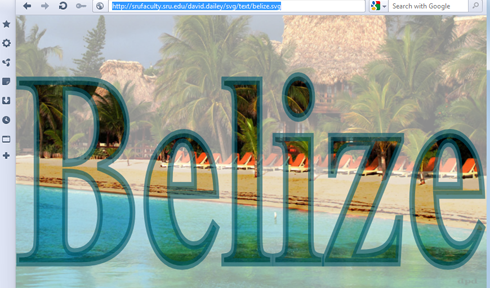 | 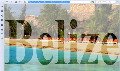 |
| Text filled with
<pattern> containing <image> ( See http://srufaculty.sru.edu/david.dailey/svg/text/belize.svg ) | Image carved by clipPath containing text (see http://srufaculty.sru.edu/david.dailey/svg/text/belize2.svg ) |
An additional advantage, as shown, is that the text can further be styled (as by a stroke) which is not true when the text remains inside a clipPath.
Drop shadow and reflections
http://srufaculty.sru.edu/david.dailey/svg/text/Pizza1.svghttp://srufaculty.sru.edu/david.dailey/svg/text/colorful3.svg
http://srufaculty.sru.edu/david.dailey/svg/text/colorful4.svg
http://srufaculty.sru.edu/david.dailey/svg/text/offsetblur2.svg
http://srufaculty.sru.edu/david.dailey/svg/text/reflection1.svg
Texture
http://srufaculty.sru.edu/david.dailey/svg/text/burst2.svghttp://srufaculty.sru.edu/david.dailey/svg/text/chrome1.svg
http://srufaculty.sru.edu/david.dailey/svg/text/chrome3.svg
http://srufaculty.sru.edu/david.dailey/svg/text/chrome4.svg
http://srufaculty.sru.edu/david.dailey/svg/text/chrome5.svg
http://srufaculty.sru.edu/david.dailey/svg/text/decorative.svg
http://srufaculty.sru.edu/david.dailey/svg/text/porcupine.svg
http://srufaculty.sru.edu/david.dailey/svg/text/offsetblur6.svg
http://srufaculty.sru.edu/david.dailey/svg/text/ripples2.svg
Distortions and warping
http://srufaculty.sru.edu/david.dailey/svg/text/crinkles1.svg
http://srufaculty.sru.edu/david.dailey/svg/text/wavy1.svg
http://srufaculty.sru.edu/david.dailey/svg/text/ripples5.svg
http://srufaculty.sru.edu/david.dailey/svg/text/ripples6.svg
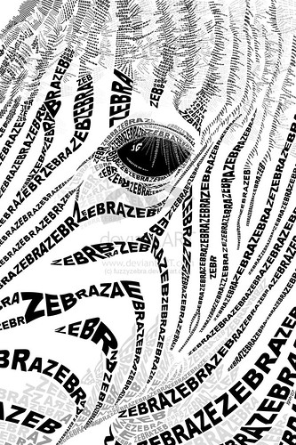
http://cs.sru.edu/~ddailey/svg/zebra1.svg
3D Effects
http://srufaculty.sru.edu/david.dailey/svg/text/offsetblur4.svg
http://srufaculty.sru.edu/david.dailey/svg/text/plastic2.svg
http://srufaculty.sru.edu/david.dailey/svg/text/plastic3.svg
http://srufaculty.sru.edu/david.dailey/svg/text/plastic4.svg
http://srufaculty.sru.edu/david.dailey/svg/text/plastic5.svg
http://srufaculty.sru.edu/david.dailey/svg/text/plastic7.svg
http://srufaculty.sru.edu/david.dailey/svg/text/plastic8.svg
http://srufaculty.sru.edu/david.dailey/svg/text/rainbow.svg
Animation
http://srufaculty.sru.edu/david.dailey/svg/text/wavy2.svghttp://srufaculty.sru.edu/david.dailey/svg/text/ripples10.svg
http://srufaculty.sru.edu/david.dailey/svg/text/ripples11.svg
http://srufaculty.sru.edu/david.dailey/svg/text/fire7.svg
http://srufaculty.sru.edu/david.dailey/svg/text/fire8.svg
http://srufaculty.sru.edu/david.dailey/svg/text/bubbles8.svg
http://srufaculty.sru.edu/david.dailey/svg/text/bubblesc.svg
http://srufaculty.sru.edu/david.dailey/svg/text/chrome6.svg
several of these effects can be seen at once at http://srufaculty.sru.edu/david.dailey/svg/text/texteffects2.htm
Case studies – what sometimes goes wrong with SVG and text.
Paste in my email to Chaals about the HTML5, and also the case study on uncopyrighted.Sample of using pictures to convey meanings
[1] The topic borders on some fairly fundamental issues of SVG
semantics, I think: in geometry, how to separate presentation from
semantics? Consider the two halves of the pseudo-glyph 5 in the HTML5
logo. The semantics *is* a 5, but what form of presentation language
would style it into four differently colored paths? That would require,
I think, a more powerful theory of presentation than the fun thing known
as CSS was intended to be. Separating the x,y coordinates from
everything else, would be an obvious course of action, but then what of
feDisplacement or transform which serve as modifiers. If we are to
extend